The Product Radar Chart: Making Smart Product Tradeoffs
In product development limited resources (time, money, or staff) force tradeoffs both at the level of the product portfolio and within individual products. Lacking a methodology for evaluating potential products, companies often make product selection decisions based on unsubstantiated factors such as convenience, the enthusiasm of the lead engineer, or the rank of the executive who cheers the loudest. The first step is to have a strong product development strategy. Then, the Product Radar Chart can help.
The Product Radar Chart offers a way to evaluate and communicate the myriad factors that go into product and portfolio decisions by graphing the key dimensions of a product or concept and comparing them to alternatives. Use this chart at the Concept Check-in stage when the development team is evaluating alternative concepts or presenting alternative products to management for approval to proceed. Rank each alternative on a scale of one to ten, with the center of the chart representing a value of zero and the outer edge of the spokes representing a value of ten.
Value to the customer is always the most important parameter. Strategic value (how closely a product maps to the company’s strategy) and investment intensity (the level of resources required to develop and market the product) also figure heavily into the equation, but they are by no means the only factors. Each factor has a different weight that is used to provide a total summary score. The ten factors that we show here are those we have found to differentiate winning, strategically-aligned products from those that fail to meet business objectives. This is not, however, a fixed list across all businesses. Each organization needs to ascertain which factors are relevant to its business success.
Using the Product Radar Chart for individual product assessments and comparing the feasibility of competing product ideas encourages transparency and consensus, in a process often marked by unclear reasoning and turf battles.
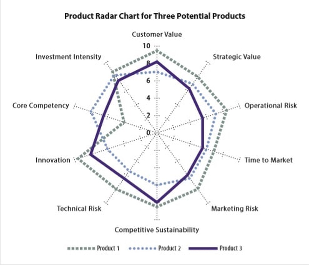
Visualization
The Product Radar Chart shows a comparison of three alternatives. In this case there are eight dimensions of product performance, rated from 0 (minimum achievement) to 10 (maximum achievement). Product 1 has the highest average score; select it if core competency gaps can be resolved.
What’s New?
As a product creator, you may have come upon a situation where you needed to choose between product alternatives. This tool addresses the need for differentiation and the creation of a total product that meets visible and invisible needs. One of the newer sets of concepts for creating product alternatives is the so-called “Innovation Tournaments” that Terwiesch and Ulrich first described. Innovation Tournaments and related internet social communities often generate several product concepts at the same time. They often compete for the same resources, so picking the best choice is an essential step. The Product Radar Chart presents a rapid, graphical, and fresh approach for evaluating alternative product concepts.
Benefits
Using a Product Radar Chart lets you organize and communicate information about data feeds related to such disparate aspects of your business as investment intensity, strategic value, customer value, core competencies, innovation, and marketing risk. Once you have this information in visual form, you can:
- Quickly identify mismatches between your current strategy and current capabilities.
- Make informed decisions about which products to invest in based on how well they map to strategy and customer value.
- Compare how different products fulfill other requirements (such as lowering risk by aligning with core competencies).
- Make tradeoffs among various products and among features of individual products.
- Communicate tradeoff decisions to corporate managers.
Which Business Problems Does the Tool Solve?
Companies usually generate far more ideas than they can afford to pursue. At the corporate level, the question then becomes how to decide which of the many potential products should receive funding. These product selection choices have far-reaching consequences both for the immediate bottom line (will they be successful?) and for the corporate identity. The products a company chooses to develop ultimately determine what kind of company it becomes.
The same tradeoff questions arise at the individual product or project level after you have researched customer needs, generated requirements, and brainstormed potential solutions. How do you decide which among the products’ many potential capabilities are worth developing for the final production version?
The Product Radar Chart lets you visually represent a multitude of attributes for portfolio and product decision making in a way that is richer and more versatile than the bubble charts typically used for such evaluations. This makes it an ideal tool for communicating and facilitating discussions of the inevitable trade-offs in managing a product portfolio.
What Else Should You Know?
A beautiful visual representation is worth nothing if you base it on faulty data. Using the Product Radar Chart assumes several prerequisites:
- Your business strategies are clear.
- You have a way to determine customer value.
- You have a process in place to evaluate factors such as operational and technical risk.
At the very highest level, before putting the Radar Chart to use, you need to understand the business your company is in. This represents the very first layer of constraint.
Because the Radar Chart makes “customer value” the central driver of all the other aspects of the business, using the chart assumes that you have a method in place to assess customer value. Ideally, this is a robust, fact-based process that relies on collecting and analyzing data without preconceptions about what customers want.
Another key to using the Radar Chart is to come up with a list of constraints particular to your business or product that will become the spokes of the chart. These might include common constraints such as competitive sustainability, technical risk, and innovation, or more particular ones such as the degree of control your organization can maintain during implementation. For example, the ink-cartridge division of a printer company might make cartridge improvements that rely on the manufacturing decisions that the company’s hardware division makes, which limits the direct control the ink-cartridge division can exercise.
Finally, you can use the Radar Chart not only for new-to-the-world products, but also for incremental extensions to existing products and even for non-product improvements, such as customer service or support.
Case Study
Let’s look at the case of a company that currently leads the market with its networking products – NetCo. To remain competitive into the future, the company is considering expanding into adjacent markets with a new product. The EVP of engineering, Bill, and his marketing counterpart will lead this project to discover the “next big thing.”
Bill has created a cross-functional innovation team that includes representatives from R&D, support, marketing, and operations, and asked them to recommend a new product based on customer research. Their research and brainstorming process has led to the definition of three potential high-speed routing products (named 1, 2, and 3), each of which scores differently in relation to the company’s major constraints.
The team plots the three products on a single Radar Chart (below), with the center of the chart representing a value of zero and the outer edge of the spokes representing higher values. When it comes to the visual representation of your assessment, higher numbers always correspond to more desirable states. This means you may need to reverse rankings depending on whether more or less of a particular attribute is desirable. For example, although a lower operational risk value is better than a higher one, you would assign the lowest operational risk a value of “10” to ensure that it falls to the outside of the spokes. Thus, a quick glance at the Radar Chart would show areas of potential concern for each product.
The Radar Chart below shows that Product 1 outscores Products 2 and 3 in the desirable traits of customer value and innovation. At the same time, however, it has a low value for core competency mapping, meaning that the company may have to outsource product development or invest heavily to bring in the necessary technical expertise. Product 2 takes advantage of existing core competencies but does not score high on customer or strategic value.
By mapping the three product options on the Radar Chart, the team can visualize the relative merits of each option, which greatly facilitates product selection.
Adapted from the Chapter “Making Intelligent Product Tradeoffs: Product Radar Chart” by Sheila Mello in the book Innovating Product Faster by John Carter and Jeanne Bradford.
Download a template for the Product Radar Chart.