Managing Project Cadence: Deliverable Hit Rate Chart
What Is the Tool? Deliverable Hit Rate Chart
The Deliverable Hit Rate tool monitors the progress of completed tasks against a target over time. Best applied to complex programs with a large number of tasks, the tool is a high level graphical representation that indicates whether the cadence of task completion is on-track for delivering the program on time.
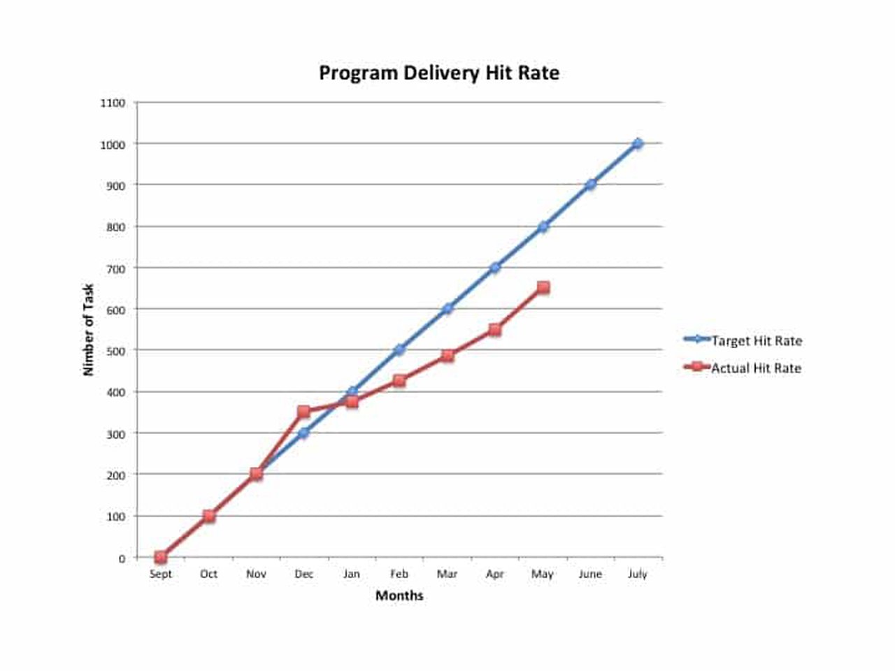
The tool is constructed by establishing first constructing a linear target rate. The target is calculated by dividing the total number of tasks required to complete the program by the duration of the program, typically measured in months. At the end of each month, the number of completed tasks is mapped against the target for that time period. A line chart is then generated to present actual vs. target.
Deliverable Hit Rate Chart. What are the Benefits?
- The Delivery Hit Rate Chart is a high level snap shot that indicates whether or not a large program is on-track for and an on-time delivery. It is a better alternative that presenting large unwieldy work break down structures or Gantt charts.
- Construction of the tool is straightforward, and provides an early warning when the team is not executing to the targeted number of tasks, thus driving corrective action to get the team back on track.
- It is an elegant solution for communicating a large amount of data in an easy to interpret graphical representation.
Which business problems are solved?
Teams that are managing large projects with hundreds of tasks on the work breakdown structures can get lost in the details of partially completed tasks and their interdependencies. In project reviews, managers don’t want to see the details; they just want to know if the team is on the right trajectory of hitting the target schedule. The Deliverable Hit Rate Chart is a high level view that will indicate whether or not the team is running at the right cadence for an on-time delivery. The historical view of tasks completed is also an indicator of the consistency by which the team is executing. This data is one indicator of predictability, and can be supplemented with specific project information in areas where the team is off-track.
What else you should know about Deliverable Hit Rate Chart?
- While an indicator of the cadence of tasks being accomplished, this tool does not discern between priority of, or dependencies on other tasks.
- The quality of the output from this tool is dependent on tasks being at a sufficient level of task granularity. It diminishes in value if applied only to high or mid-level milestones.
- While the tool does not provide insight on why the team is ahead or behind on task execution, it can provide an early warning to a risk of significant schedule compression, or schedule slip, on the back end of the schedule, and trigger analysis and risk mitigation measures.
Case Study
Netco is delivering a new product to market that requires contribution from thirteen different teams. There are sixty people working on the project. Richard, the program manager, has constructed a large work break down structure that includes a low level of task granularity, with milestones, interdependencies and resources. In addition to managing the work break down structure, he needs to provide monthly management updates to demonstrate progress of the team. To provide a high level overview of the team’s performance to plan, he constructs a delivery hit rate chart.
As seen in the visualization below, the team got off to a good start, but has fallen behind. This graphical representation can be used to show the contrast between targeted and actual cadence of completed tasks. Richard can then supplement his management report with specifics from the work break down structure that has driven the under performance of the team, and a corrective action plan for getting back on track for a July delivery.
Visualization

