Skip to content
 What’s New?
Software development has migrated to some degree from the waterfall model, where there is a clear handoff from one stage to the next, to agile development, where iteration of builds is the dominant paradigm. In agile development, the team goes through the whole requirements (build/integrate/test cycle) with the goal of solving the greatest number of user stories or requirements per build. Tracking the number of user stories completed per build as well as displaying them in a graphical format in the team workspace is an emerging practice that combines many best practices in one easy-to-use system.
What Is the Tool? Agile Burndown Graph
Before defining the burndown graph, we should first describe the agile process. The essence of agile development is turning user stories into code and testing them with a proxy for the customer. Each cycle is called a sprint, with the goal of doing as many use cases (or user stories) as possible in each sprint. As each sprint is completed, a number of user stories are addressed and the team plans the next sprint to make further progress. At the end of each day, the number of use cases accepted by the customer representative on the team is subtracted from the total, and thus the team can see how rapidly they burned down the use cases during the sprint.
The team would list the number of use cases over a given sprint period, which indicates the number of use cases per week. This along with the number of sprints would yield the development duration. In order to estimate the length of a given development effort, the project manager would divide the number of user stories by the number of sprints and multiply that by the duration of the sprints. However, things change. The team can knock off more (or fewer) user stories per sprint. The team can have the user stories change, so there are more (or less) to code. This tool allows the team to dynamically estimate the completion date based on the extrapolation of real project data.
With an understanding of agile development, we can now frame out the role of the burndown chart. The burndown chart is a living graph that shows the team and management how much progress they are making on the real project. The vertical axis is the number of user stories remaining to be put into the release. The horizontal axis is the sprint number, which can be equated to a time scale. Because the number of use cases can change, it is possible to add a representation of the number of new user stories below the horizontal axis. This burndown graph is much more meaningful than a Gantt chart since the graph includes on the vertical axis the number of user stories, which is fundamentally linked to the work required in the project.
A target line is drawn from the starting point of the total number of use cases, extrapolating from the slope of the user stories over time. Another target line is extrapolated from the number of user stories added below the horizontal axis, based on the trend of the number of additional user stories. Where these two lines intersect is the projected sprint number when the project is finished.
This graph is created in a poster size and is posted in the team workspace. It has all the benefits of a great predictive metric in that it is lightweight and does not require IT systems to be implemented. It is also graphical and easy to understand. In addition, it can show targets so that the team can instantly see where they are off course. Finally, it can help the team course correct in real time (at least in the sprint intervals) to bring the project home.
What Are the Benefits of this Technique?
- Focuses on the customer as the primary vertical axis indicates the number of user stories
- Follows the best practice of predictive metrics, so course corrections can be made
- Displayed in an easy-to-understand graphical representation
- Shows the actual work delivered, so it is a true measure of progress
Which Business Problems Do We Solve?
The most important benefit of this chart is that it keeps the team and management focused on what matters in product development – delivering features that count to customers in the fastest and most innovative way possible. In this development style, user stories can be added during the agile process without upsetting the whole development process. Everything is incremental and fluid so that management can easily see the tradeoffs between schedule and feature delivery.
What Are some Considerations?
There are many key factors to successful deployment, but the most important is that the user stories are properly captured in the first place. If the proper requirements collection is not done, then the team will go on a path that will not lead to the project’s success.
Another risk factor is that user stories get watered down during the execution so that the full functionality is not delivered during the sprint. Having a strong customer representative in the process can help minimize this impact.
Finally, there is a fair amount of effort that needs to be placed into updating this chart. The responsibility for updating agile metrics must be placed squarely on one of the team members to ensure accurate and timely metrics.
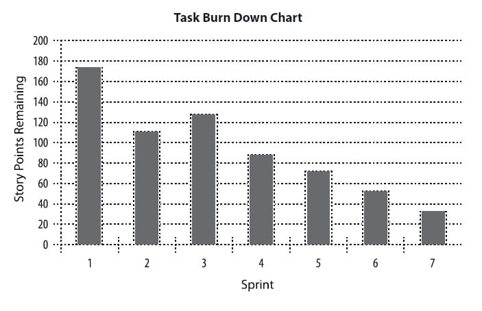
Case Study
The IT department of a medium-sized company was developing a social media strategy for corporate-wide implementation with a pilot rollout with a technology partner. They agreed on an agile development approach to the project and assigned members from both companies to the team. This team settled on two-week sprints and was anticipating eight of them to get the project done.
In the past, waterfall development was used, and management never really knew where the project stood. However, in this case, the agile development method with burndown charts proved instrumental from the beginning. For example, this process forced the business analysis to clearly identify all the user stories from the beginning of the project. In the past, this was done in a sloppy fashion, and only in the pilot stage did management know that the requirements were incomplete.
With this burndown chart approach for displaying progress, management could carry out the initial plan and see how, at the third sprint, the user stories were taking a big jump up. This caused a management review halfway through the pilot development and the resetting of management’s expectations. The result was a better system delivery, with dates that management could understand.
Visualization